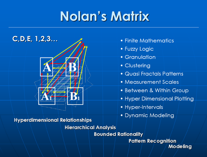
This tool takes produces a dendrogram and a surface chart from a matrix where each variable is compared against each other variable. At each intersection of the variables there is a Nolanlean value of the impact each variable has on each other in a positive and negative focus. The range of entries is very low, low, average, high, very high. The end results are something like
A vs B – Positive outcome (very low, low, average, high, very high) + Negative outcome (very low, low, average, high, very high)
B vs A – Positive outcome (very low, low, average, high, very high) + Negative outcome (very low, low, average, high, very high)
The resulting matrix represents the possible impacts on a variable from all other variables in the Omnisignature. The dendrogram shows groupings of like variables based on their impact within the Omnisignature, while the surface chart shows the geography of the data landscape, if the dataset were turned into knowledge plain where you could walk through your matrix. The mountains would represent the overall positive interactions and the valleys the overall negative interactions.